
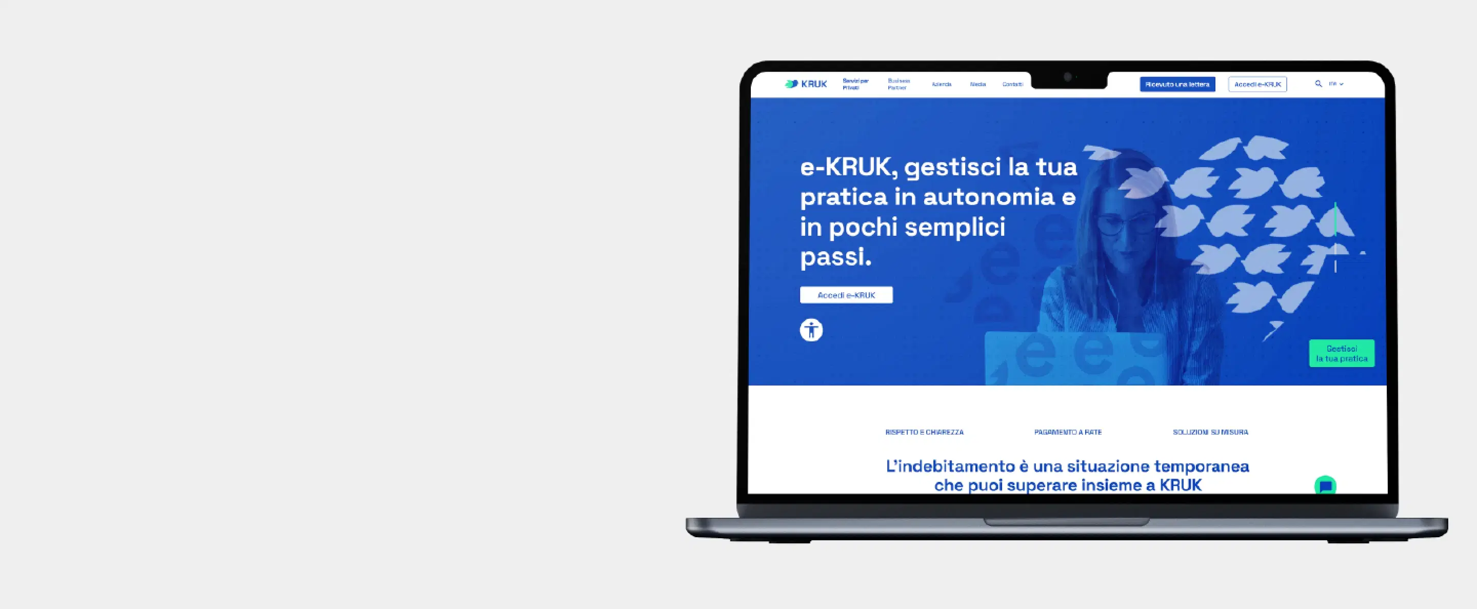
Kruk Italia
Website for Kruk Italia, a multinational group operating in the credit management sector—an industry where trust, clarity, and accessibility are essential for both users and stakeholders.
Details
Website Redesign
Kruk Italia-2025
Role
UX Research
Branding
UI Design
Duration
100 hours
Team
Enrica D’Elia
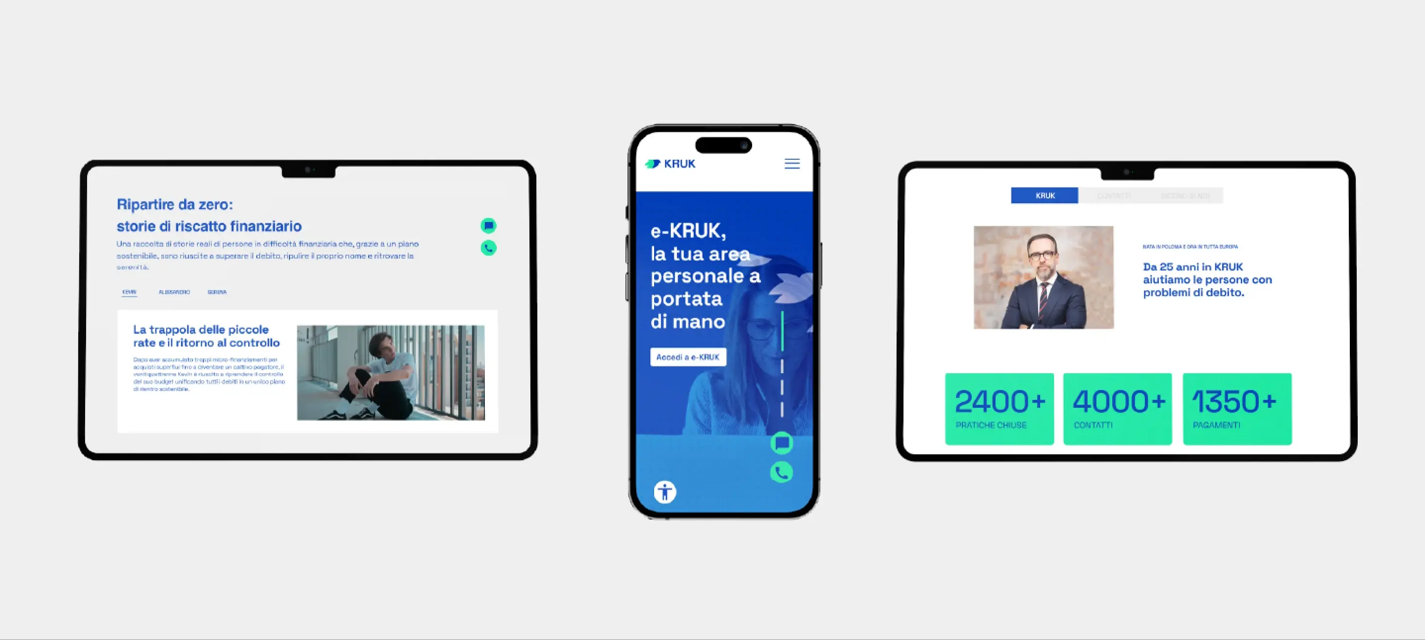
The problemCommunicating credit: clarity, trust, and accessibility
The main challenge was to communicate complex and sensitive financial information in a clear, transparent, and intuitive way to a highly diverse user base. It was essential to strengthen the trust and perceived reliability of the KRUK Italia brand through its digital touchpoint, while ensuring high standards of accessibility and usability. The system therefore had to meet a dual need: on one hand, enabling end-users to easily manage their credit-related activities; on the other, satisfying the strategic goals of the company's internal stakeholders.
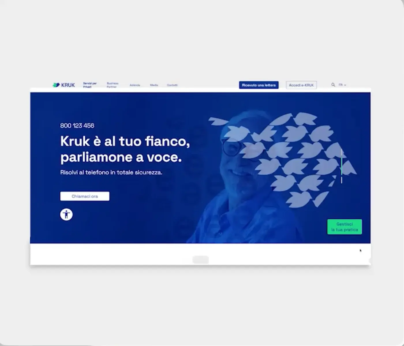
Research objectivesThrough user interviews and surveys, I aimed to:
- Evaluate how easily users could find key information.
- Assess the user's emotional state during navigation, identifying friction points to design reassuring and supportive elements.
- Investigate how effectively the content guides users toward debt resolution solutions.
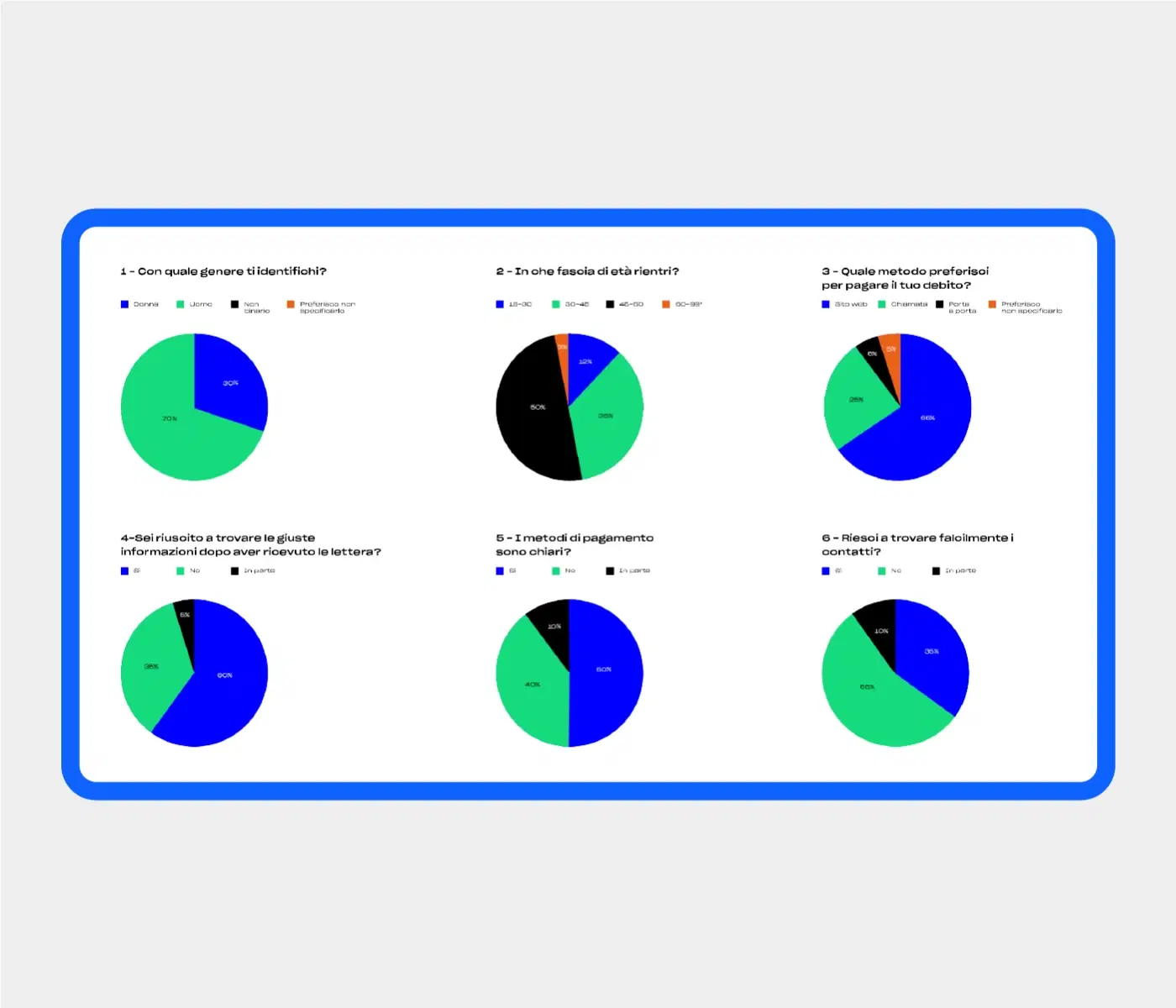
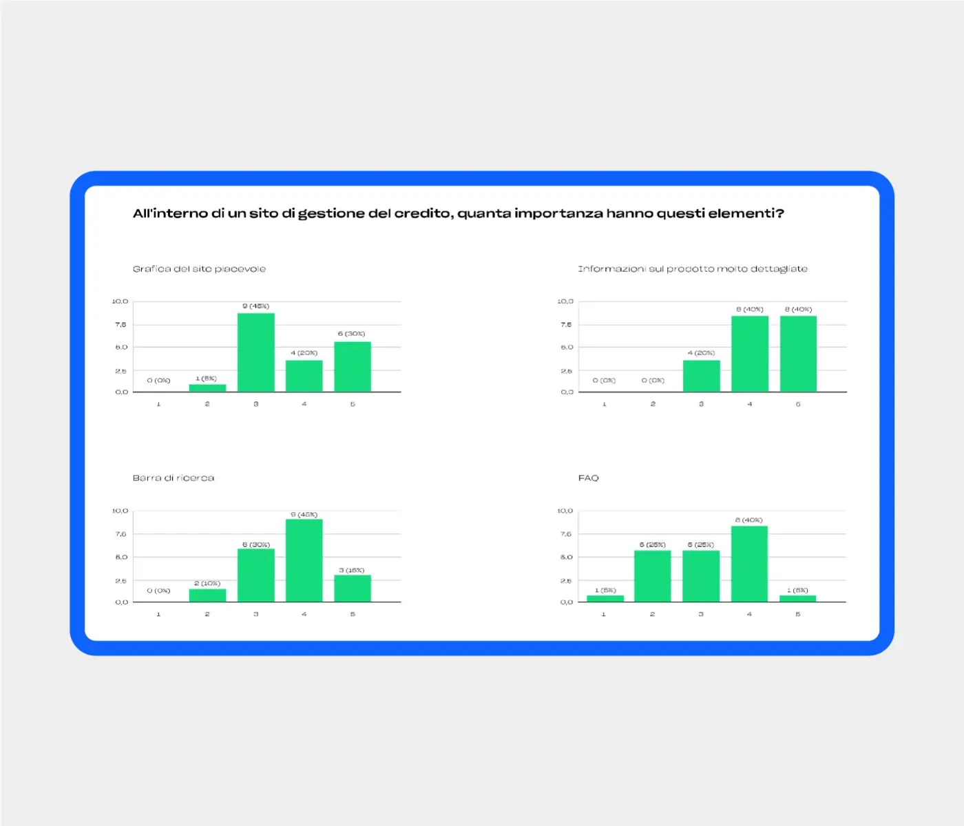
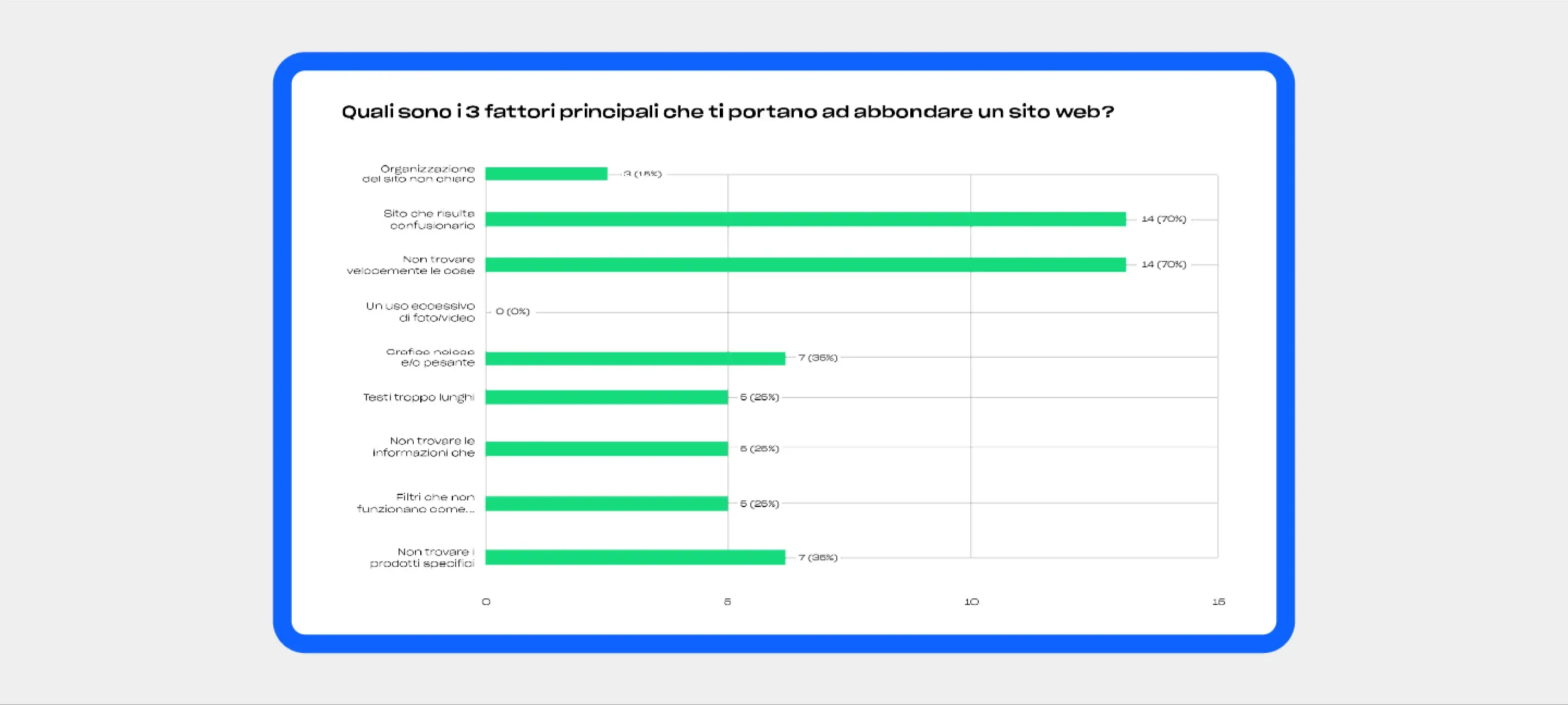
Understanding the User:Insights from Interviews & Surveys
The website is the customer portal for KRUK Italia, a debt collection company. Users arriving here are sometimes facing financial difficulties, and may feel anxious or distrustful after receiving a letter. This shifts the UX priorities: clarity, reassurance, and reducing friction matter more than traditional commercial persuasion.
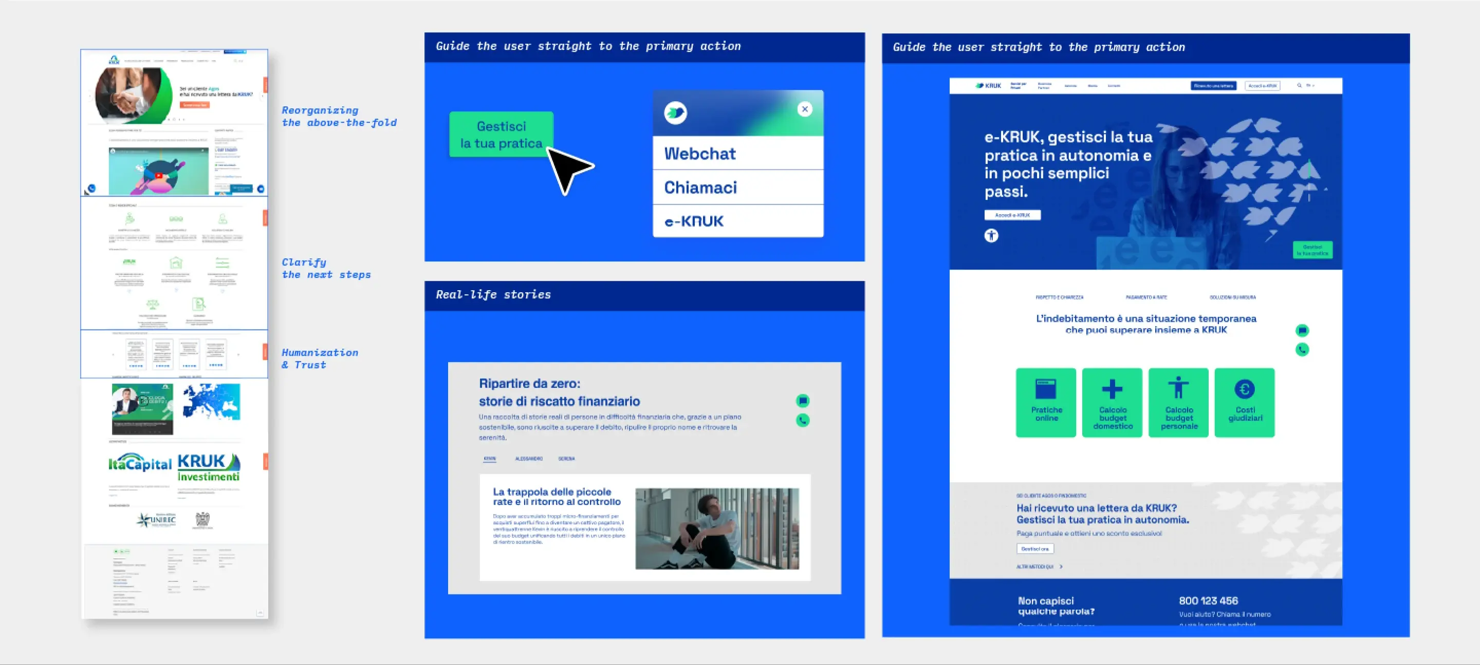
The Power of Empathetic Storytelling
Humanization & Trust: Using relatable, real-life stories breaks down distrust and reduces the stigma surrounding debt.
Ambiguity & Friction in Entry Flows
Immediate Orientation: A guided flow in the Hero Section will immediately clarify the next steps, simplifying the user experience.
Cognitive Overload & Visual Fragmentation
Visual Hierarchy: Reorganizing the above-the-fold area following a "less is more" approach will guide the user straight to the primary action.
Not Your Average Customer:The User Persona
The audience is not a "customer" in the traditional sense (they did not choose to be there), but rather someone who received a notification from KRUK after their debt was sold by a bank or financial institution (e.g., Findomestic, Agos). Common characteristics:
Initial Emotional State
Anxiety, distrust, and often shame.
Primary Goal
Understanding "what is happening to me" and "how do I get out of this" with the least amount of friction or pain.
Very Wide Age Range (from 20 to 70+)
Resulting in highly uneven levels of digital literacy.
Motivation to Act
Often reactive (triggered by receiving a letter) rather than proactive.
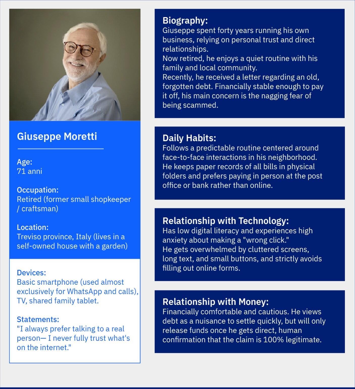
Persona 1Elderly person unconcerned about debt
Context
Debt incurred years ago, perhaps forgotten or never resolved; a letter arrives and revives an old issue. Usually, they can afford to pay. They often fear being scammed.
Device
Likely desktop or a basic smartphone, with low digital literacy for online forms.
Primary Need
Needs to speak with a person multiple times and refuses to fill out forms. Crucial to verify that the letter is not a scam.
Pain Points
Too many elements on the homepage, long texts, and CTAs that are not large or clear enough; fears making a "wrong click."
What they are really looking for
A highly visible phone number and confirmation of authenticity (ID card explanation, identity verification).
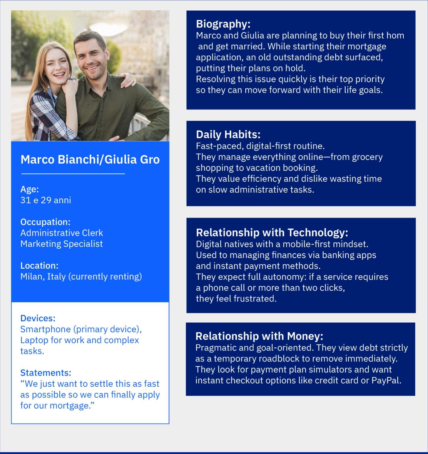
Persona 2The couple with a blocked life goal
Context
Young adults; debt is a concrete obstacle to a major life project (e.g., getting married, buying a house, getting a mortgage).
Device
Mobile-first; used to doing everything online (banking apps, digital payments).
Primary Need
Speed and autonomy – they want to resolve the issue without calling anyone, quickly understanding the figures and repayment plan options.
Pain Points
If the self-service path (e-KRUK) is not accessible within 1-2 clicks from the homepage, they feel slowed down; the domain change to e-kruk.it can cause a moment of doubt ("am I still on the right website?").
What they are really looking for
Repayment plan simulation, instant payment via card/PayPal, all without waiting.
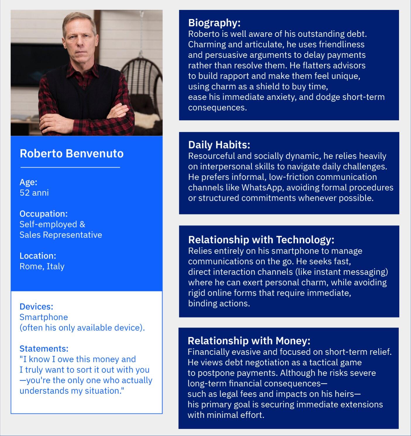
Persona 3Aware of the debt, skilled manipulator
Context
Presents themselves as kind, aware of the debt, and seemingly willing to resolve it. In reality, they are a skilled manipulator who lies with strong arguments, makes promises, and uses strategic dialogue to make the advisor feel special.
Device
Smartphone, often the only device available.
Primary Need
To buy time and avoid the immediate problem to ease anxiety, without facing consequences.
Pain Points
The fear that drives them to run away, the predictability of their pattern (which is easy to expose), and the real risks they accumulate by delaying (legal fees, impact on heirs).
What they are really looking for
They try to disarm the advisor with friendliness to get an easy extension, wanting simple explanations, low-friction contact channels (like WhatsApp), and reassurance that asking for help will not lead to immediate legal consequences.
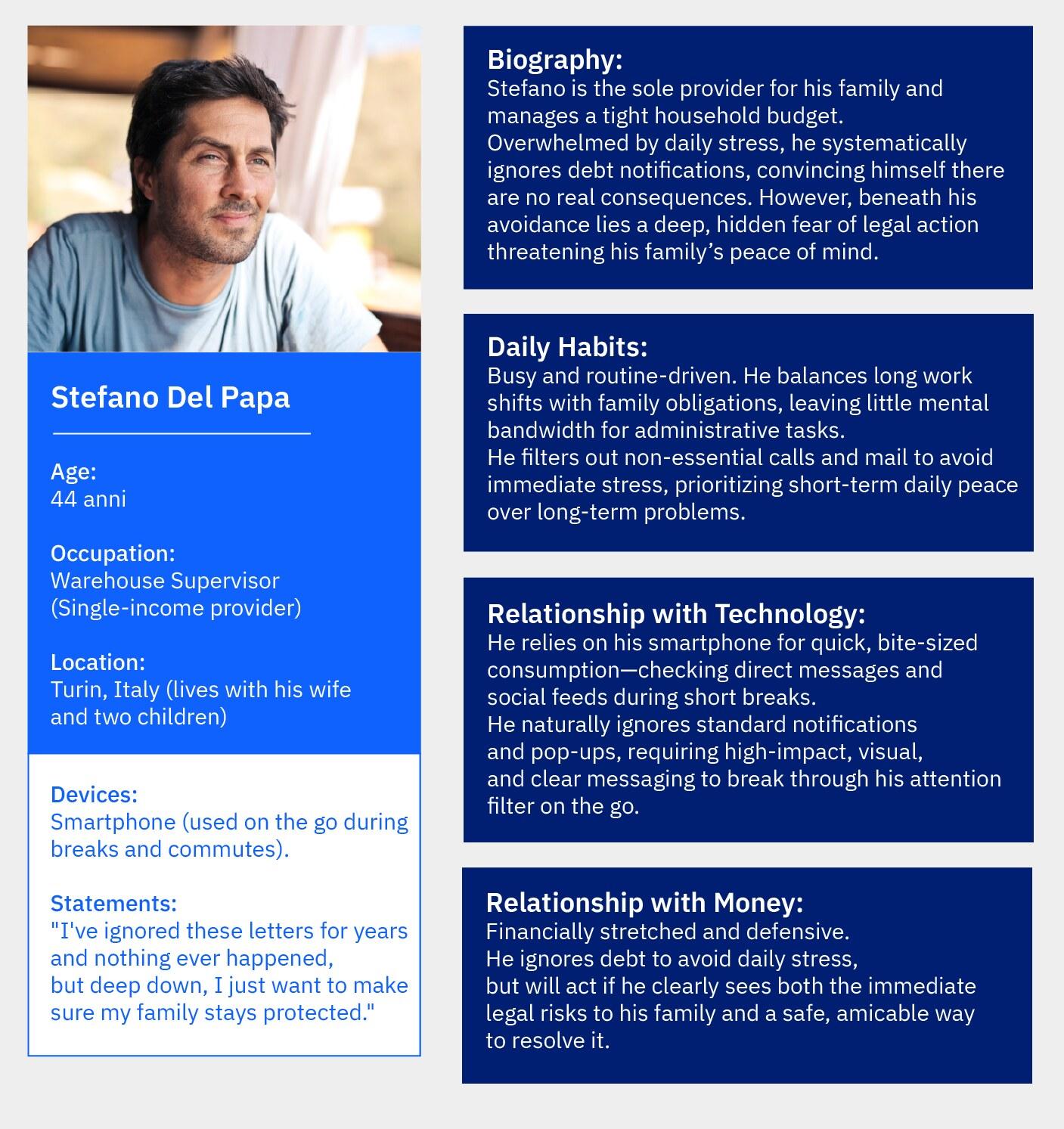
Persona 4The man who consciously avoids
Context
Single-income family with children and a stressful routine. The user systematically ignores all contact due to distrust and habit, convinced they do not risk anything in practice.
Device
Smartphone and direct messaging. The interface must capture attention on the go, overcoming their mental filter and tendency to ignore notifications.
Primary Need
To perceive KRUK as an authoritative partner and immediately understand the real severity (and proximity in time) of legal consequences if they continue to delay.
Pain Points
The tension of an ignored debt and the hidden fear of compromising their family with sudden legal action (e.g., an injunction), while struggling to admit their own vulnerability.
What they are really looking for
To protect their family's peace of mind. They look for concrete proof of advantages compared to other debt collection agencies through real stories and amicable solutions.
Strategic summaryPersonalizing access to reduce uncertainty
Although the four personas have different ages and digital skills, they all share the need to quickly reduce uncertainty. This goal is hindered by a generic homepage, which instead requires distinct entry paths for each profile.
Framing and routing
Immediately offer 2-3 clear options based on intent to split user flows and avoid generic navigation.
Contextual glossary
Include simple explanations (tooltips) for technical terms to support non-native citizens and less experienced users.
Prominent phone CTA
Make the phone number large and instantly clickable for those who refuse digital forms.
Seamless self-service e-KRUK experience
Eliminate unnecessary clicks and maintain consistent branding to prevent any sense of disconnection from the main website.
Information Architecture:Sitemap and Flows
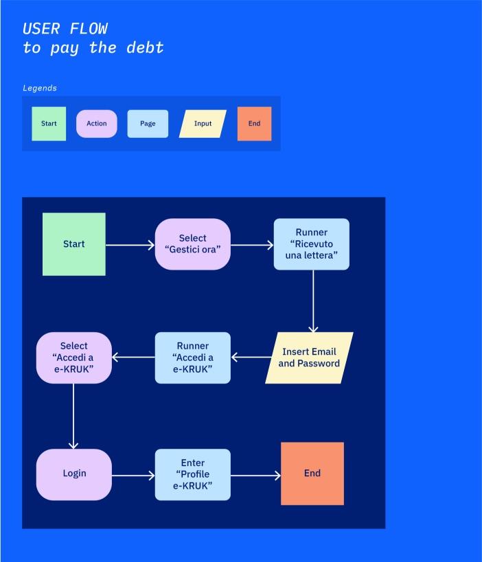
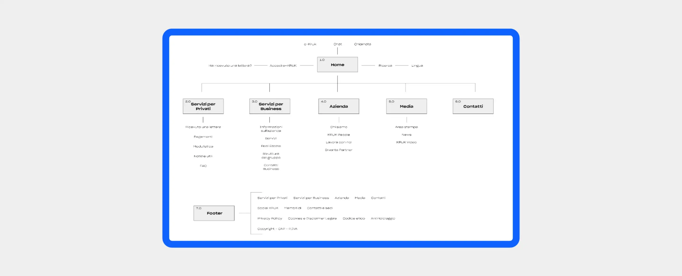
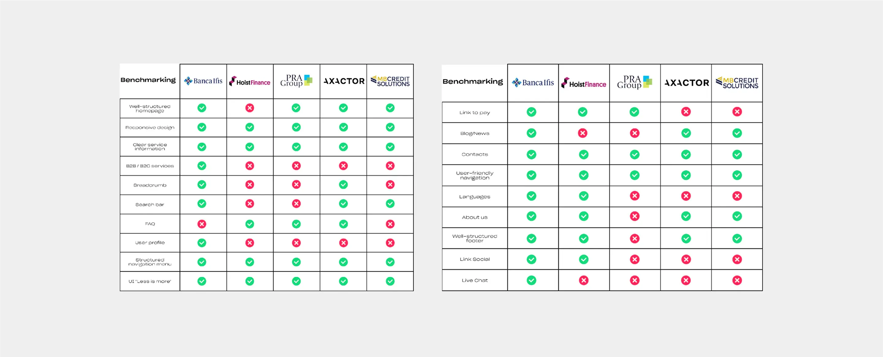
The website analysis revealed the need to move past a generic homepage that forces users with opposing needs—such as human contact, self-service management, or language support—to follow the same path.
The design solution redesigns the sitemap by introducing an explicit initial split: the user flow immediately routes the user toward one of three specific paths, reducing the steps required to reach their goal while always guaranteeing a safety net to phone support.
From flows to structure:low-fidelity wireframes
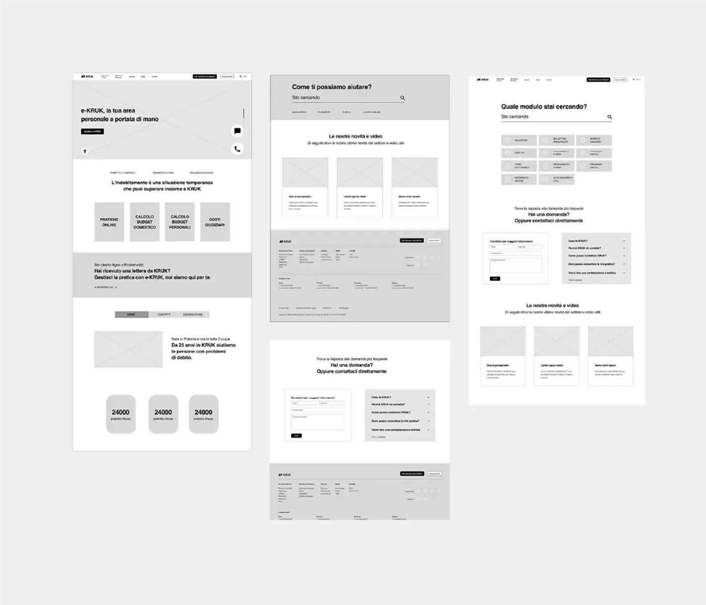
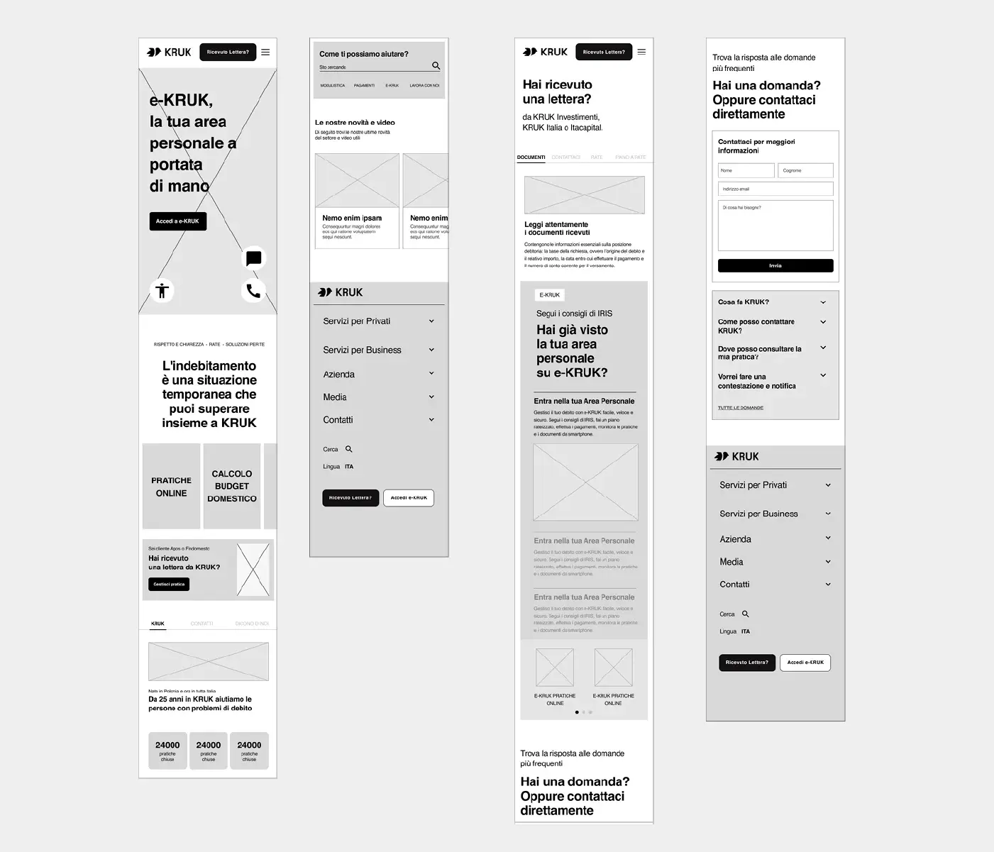
The wireframes translate the user flow priorities into low-fidelity interfaces, defining the structure and hierarchy of contents without the distraction of visual details. The screens concretely establish the key strategic points: the initial split in the hero section, tooltips for the contextual glossary, maximum prominence for the phone CTA, and a seamless transition toward the self-service area.
The Evolution of KRUK Italia’s Visual Identity:Balancing Solidity and Modernity
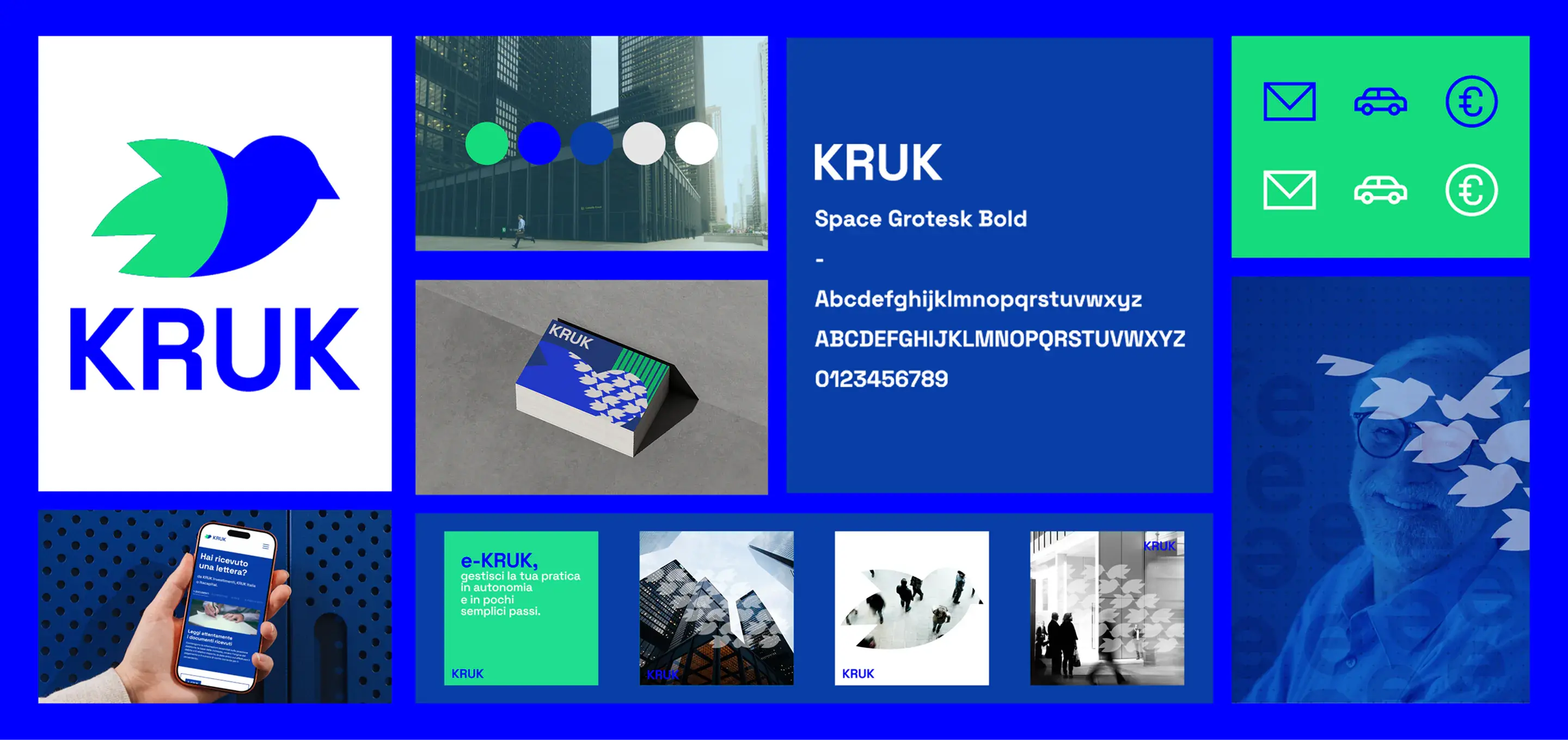
The rebranding project for KRUK Italia modernizes the company’s visual identity while maintaining its core heritage. The raven—the central symbol and literal meaning of the Polish word "Kruk"—has been redesigned with clean, geometric lines, while the original color palette has been updated with brighter, more contemporary shades to inject fresh energy. This visual evolution is anchored by the uppercase Space Grotesk Bold typeface; its balance of sharp geometry and fluid curves perfectly reflects the dual nature of the credit sector—combining institutional solidity with the flexibility needed for effective management.
Test objectivesand brand perception
The tests aim to validate the product through three pillars:
Concept validation:
Verify that the features meet real user expectations, gathering feedback to customize them.
User flow:
Observe new users during navigation to ensure they complete tasks easily and without errors.
Brand perception:
Evaluate the initial impact and users' response to the app's name, color palette, and aesthetics.
Test results:flow validation and impact on personas
Effectiveness of the initial split:
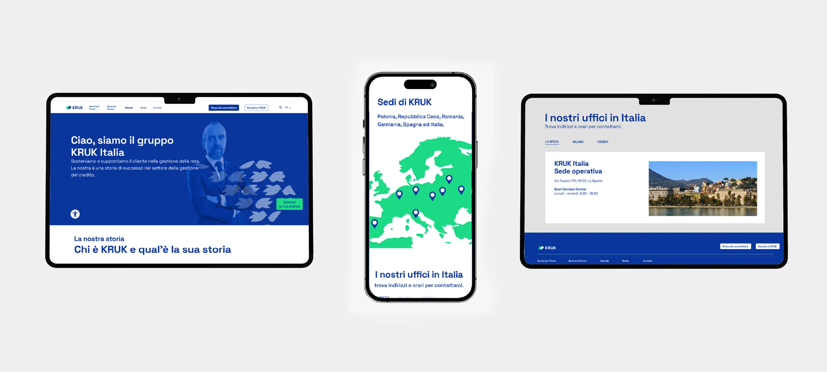
The new routing system reduced orientation times and friction in the user flows across all tested profiles.
The older adult and the manipulator (Phone/chat contact):
75% of participants located the contact information in less than 10 seconds (a sharp improvement compared to the estimated 30 seconds on the old website), although some still felt the need for verbal confirmation of authenticity.
The couple with a blocked goal (Self-service area):
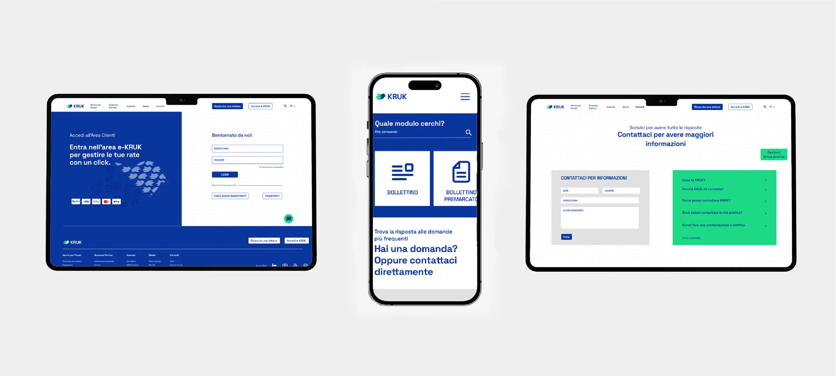
The path to the repayment plan simulation was reduced to just 2 steps; 85% of users completed the task without perceiving any disconnection from the main website, confirming the effectiveness of the brand consistency.
The distrustful man (Contextual glossary):
60% spontaneously used the technical tooltips, with 90% of them gaining a significantly better understanding of their financial situation, though 40% did not notice the tool at first glance.
Work Gallery
My work starts with a simple principle: truly understanding what's needed.
No unnecessary complexity — just listening, honest dialogue, and a shared strategy. We define priorities, then I design, test, and refine to create solutions that grow with your brand.

Every project begins with a conversation.
Let's start one. Contact me